


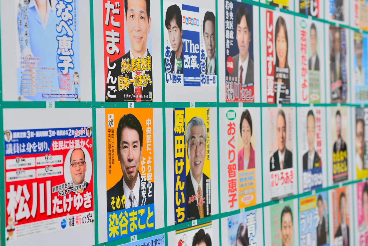
We're right in the middle of the city council election.
Candidates' posters are up all over the city, and campaign cars keep driving past our Merci office.
Candidates' slogans really are something, aren't they?
"Dynamism!"
"Getting things done"
"A man of action"
"Citizens First"
"Challenge!"
"Running at full speed!"
I imagine the usual approach is to keep the slogan short so it's easy to remember along with the candidate's name at a glance or on first hearing, but honestly, they all feel rather vague to me.
I can't picture what specific benefits there would be if this person were elected, or what would actually change (I'm sure there are all kinds of restrictions involved, though).
Yesterday the newspaper carried a list of the candidates and I read through it all, and here too the differences were obvious.
Some panels made me think, "Ah, they probably put this together themselves in Word or something," while others made me think, "They must have brought in a production company and worked this out carefully." There were clear differences in design, and in the copy too: some felt — pardon my bluntness — purely superficial, making me wonder "Has this person really thought about why they're running?", while others made me think, "These words come from having a concrete vision."
I'm being terribly presumptuous here, sorry!!
But I'll be going to vote based on this list of candidates.
And I'm sure I'm not the only one who uses it to decide who to vote for.
So that candidate listing space must be incredibly important.
I often say this to clients we already work with, but the power of copy is enormous.
Especially for prospects who are already interested in the product or service you're selling, what the copy communicates matters far more than the design of the ad.
That's because prospects who are already interested want information more than a cool, cute or pretty atmosphere.
People often look at websites, mobile sites, flyers and so on and say
"With this much text, won't people lose the will to read it?"
But the people who lose interest and leave were unlikely to take the final action (purchase or inquiry) in the first place.
Of course, when we write copy we pay careful attention to how it's written, the wording, the layout and so on to make it as readable as possible, but people who give up just because of how much text they see at a glance usually weren't important customers to begin with.
On the contrary, the real "evil" is worrying so much about the amount of text that you fail to tell genuinely interested prospects what they need to know. They picked up your ad because they wanted information — and you, the very person who should be giving it to them, are limiting how much you provide.
That's why the websites, mobile sites and flyers we create tend to have a relatively large amount of text.
We don't write a lot on purpose. We write it because it's necessary.
The same goes for video.
"Nobody's going to watch a video longer than three minutes, right?"
You hear that a lot. People who have no need to watch may indeed not watch, but people who have a reason to watch will watch regardless of length, as long as they judge the information to be what they need.
If the information is necessary but still isn't being watched, then either it's being communicated poorly, or it wasn't made with the prospect's viewing environment in mind.
So with video too, length (the equivalent of quantity in copy) is not what determines whether a video is good or bad.
Make sure you fully communicate the information your prospects want and need.


